Now we will work on the last few pages, related to the Contact.
Contact Search Page
The contact search page is very similar to the other search pages. It has searchParams state variable, which is initialized from the url search params, just like we created the phone label search page in the previous article.
We have useEffect hook that is fired when the searchParams is updated. The useEffect hook gets the paged response of Contacts from the web API, by calling the API helper methods and passing them the parameters of type ContactReqSearch.
The searchParams state variable is updated when
- previous or next buttons are clicked
- user types in the search text and presses enter button or search button
- search params manually entered in browser
Contact Response shows One Phone numbers and One Email
There are few differences in Contact and phone label search. Phone label search returns the data in object of type PhoneLabelRes, which contains simple fields. However, the Contact search returns the data in object of type ContactRes, which has related data as well. See the response Dto below.
export interface ContactRes {
  contactId?: number;
  firstName?: string;
  middleName?: string;
  lastName?: string;
  pictureUrl?: string;
  company?: string;
  jobTitle?: string;
  department?: string;
  dateOfBirth?: Date;
  notes?: string;

  contactLabels?: ContactLabelRes[];
  contactEmails?: ContactEmailRes[];
  contactPhones?: ContactPhoneRes[];
  contactAddresses?: ContactAddressRes[];
  contactWebsites?: ContactWebsiteRes[];
  contactChats?: ContactChatRes[];
}
In Contact repository search extension method, we included the related phone and email, only the first record. Lets have a look at the Contact Repository search method again. It includes ContactPhones and calls Take(1), which means include only one phone number of this contact. Similarly we also include ContactEmail and call Take(1), to include only 1 record of his emails. If we do not call Take(1), it will include all the phone numbers. But in search result, we only want to show 1 phone number and 1 email address, so we take only 1 record.
var itemsToReturn = items
  .Include(x => x.ContactPhones.Take(1))
  .Include(x => x.ContactEmails.Take(1))
  .AsQueryable();
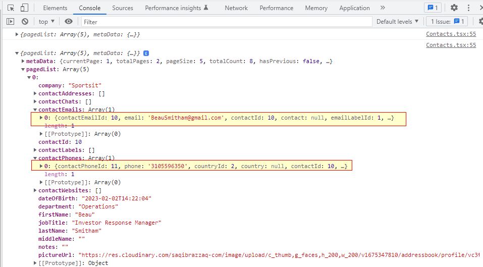
When we call the Contact search API and print the output in console, it will show the following results. Note that contactEmails and contactPhones arrays have only 1 item. Other arrays contactAddresses, contactChats, contactLabels and contactWebsites have 0 items. There might be record in the database, but in response there are 0, because we did not include in the Search method in repository.
Display Profile Picture in Table
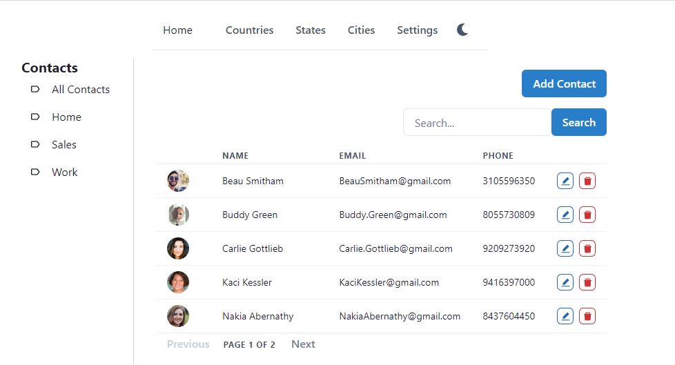
The Contact response dto also has pictureUrl, which has the Url of profile picture. We display the profile picture using the Avatar component of Chakra UI. The Avatar component is extremely easy to use. We just provide size (sm) and src (Url) and it shows the profile picture in the table data.
<Td onClick={() => navigate("/contacts/edit/" + item.contactId)}>
  <Avatar size={"sm"} src={item.pictureUrl} />
</Td>
You can refer to GitHub repository for complete code.
Below is the screenshot of the search contacts page.
Create or Edit Contact Page
This page is going to be complex than other pages we have created so far. In this page we will be managing
- Edit fields which are directly present in the Contact table
- Show Contact header with image
- Load data from Contact table, no related data
- Load data separately from ContactPhone, ContactEmail, ContactWebsite, ContactLabel, ContactChat and ContactAddress tables
- ContactPhone, ContactEmail and remaining 4 linked entities will have their own create/edit and delete pages
Stay tuned, we will build this page progressively.
Create/Edit Contact table fields
Lets start with the basics first by developing a create/edit page for the Contact table fields. This is very simple for us, as we already did such edit page for Country, State, City and all the 6 labels.
Create a new file ContactEdit.tsx in src\pages\contact folder. Type rafce and insert the default template code.
The Url of edit contact will have the following pattern
- http://localhost:3000/contacts/edit – create new contact
- http://localhost:3000/contacts/edit/10 – update an existing contact with id 10
So we need to get the contactId from the url, if present.
const params = useParams();
const contactId = params.contactId;
const updateText = contactId ? "Update Contact" : "Add Contact";
After that we will load contact data from the web API in useEffect hook. The useEffect hook will fire when contactId variable is updated.
const [contact, setContact] = useState<ContactReqEdit>(new ContactReqEdit());

useEffect(() => {
  loadContact();
}, [contactId]);

const loadContact = () => {
  setError("");
  if (contactId) {
    ContactApi.get(contactId)
      .then((res) => {
        setContact(res);
      })
      .catch((error) => {
        setError(error.response.data.error);
      });
  }
};
Then we will define the validation schema using Yup, for the Contact entity. Only firstName field is required, rest are optional.
const validationSchema = Yup.object({
  firstName: Yup.string().required("First Name is required"),
  middleName: Yup.string(),
  lastName: Yup.string(),
  pictureUrl: Yup.string(),
  company: Yup.string(),
  jobTitle: Yup.string(),
  department: Yup.string(),
  dateOfBirth: Yup.date(),
  notes: Yup.string(),
});
Lets create submit form method before creating the form. If contactId is valid, we will update existing contact, otherwise we will create a new contact.
const submitForm = (values: ContactReqEdit) => {
  if (contactId) {
    updateContact(values);
  } else {
    createContact(values);
  }
};

const updateContact = (values: ContactReqEdit) => {
  setError("");
  ContactApi.update(contactId, values)
    .then((res) => {
      loadContact();
    })
    .catch((error) => {
      setError(error.response.data.error);
    });
};

const createContact = (values: ContactReqEdit) => {
  setError("");
  ContactApi.create(values)
    .then((res) => {
      navigate("/contacts/edit/" + res.contactId);
    })
    .catch((error) => {
      setError(error.response.data.error);
    });
};
In the main return method, we will display the layout of the page by displaying the components
- displayHeading – displays the heading and back button
- error – shows the error alert, if any
- showUpdateForm – displays the Formik form
return (
  <Box fontSize={"md"} width={"2xl"} p={4}>
    <Stack spacing={4} as={Container} maxW={"3xl"}>
      {displayHeading()}
      {error && <AlertBox description={error} />}
      {showUpdateForm()}
    </Stack>
  </Box>
);
We will share Formik code for one field here, as the complete code will be too long for this article.
const showUpdateForm = () => (
  <Box p={0}>
    <Formik
      initialValues={contact}
      onSubmit={(values) => {
        submitForm(values);
      }}
      validationSchema={validationSchema}
      enableReinitialize={true}
    >
      {({ handleSubmit, errors, touched, setFieldValue }) => (
        <form onSubmit={handleSubmit}>
          <Stack spacing={4} as={Container} maxW={"3xl"}>
            <FormControl isInvalid={!!errors.pictureUrl && touched.pictureUrl}>
              <Field as={Input} id="pictureUrl" name="pictureUrl" type="hidden" />
              <FormErrorMessage>{errors.pictureUrl}</FormErrorMessage>
            </FormControl>
            <FormControl isInvalid={!!errors.firstName && touched.firstName}>
              <InputGroup size={fontSize}>
              <InputLeftAddon children="First Name" />
              <Field as={Input} id="firstName" name="firstName" type="text" />
              </InputGroup>
              <FormErrorMessage>{errors.firstName}</FormErrorMessage>
            </FormControl>
            // other fields
            <Stack direction={"row"} spacing={6}>
              <Button type="submit" colorScheme={"blue"}>
                {updateText}
              </Button>
            </Stack>
          </Stack>
        </form>
      )}
    </Formik>
  </Box>
);
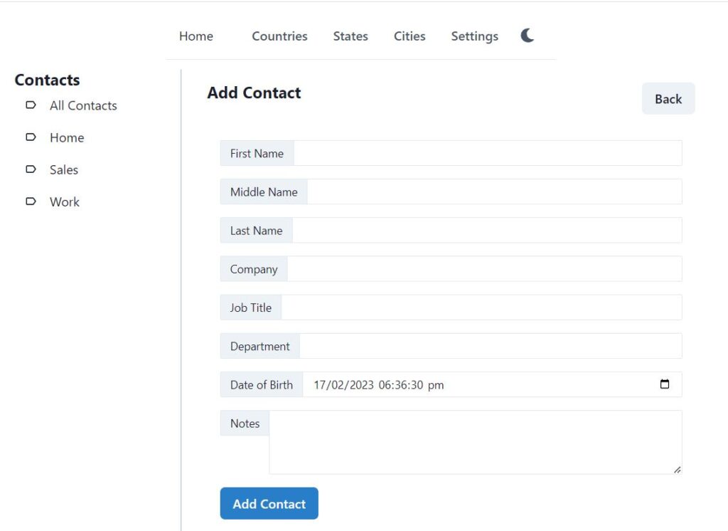
If you create a new contact with url http://localhost:3000/contacts/edit, it will display the page as follows. It displays empty form, there is no contactId in the Url, so no contact data is loaded from the web API.
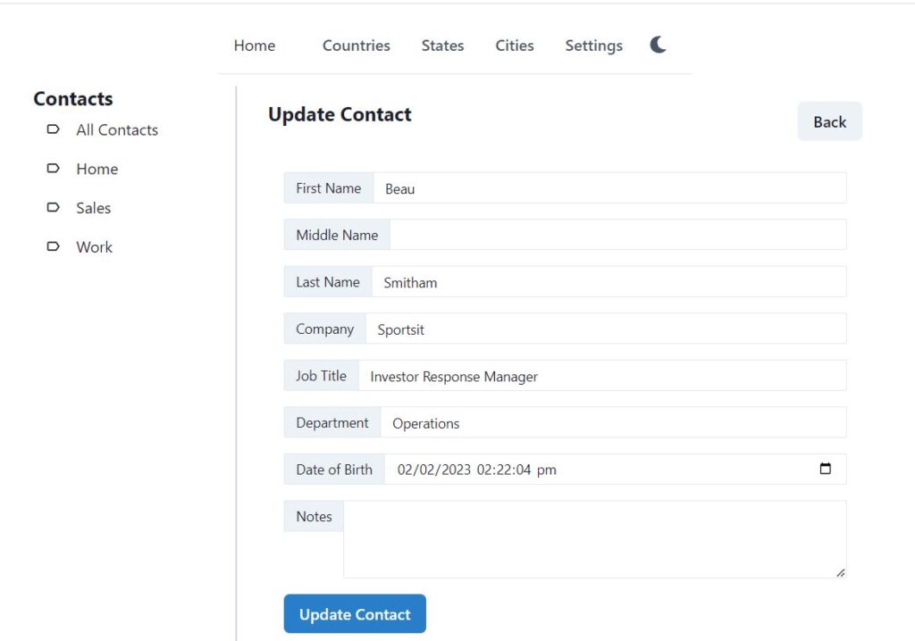
If you try to edit an existing contact, it will load the form with data. The only required field is first name, so the contact can be saved. The phone numbers, emails, addresses etc are optional, so it is perfectly fine to save the contact with just first name and Contact direct fields.
Contact Header with Profile Picture Display
Take a look at the below screenshot, it is taken from Google Contacts. We have created a temporary contact and assigned a profile picture to it. When we click on the contact it displays profile picture with name and company details on top. The interface looks very beautiful.
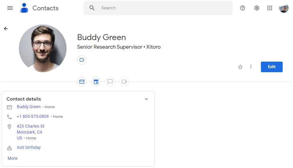
What if we remove the profile picture and company details from this contact, how it will look? It might look similar to our app, just plain text, no design, no image, it will be plain boring, just like our app.
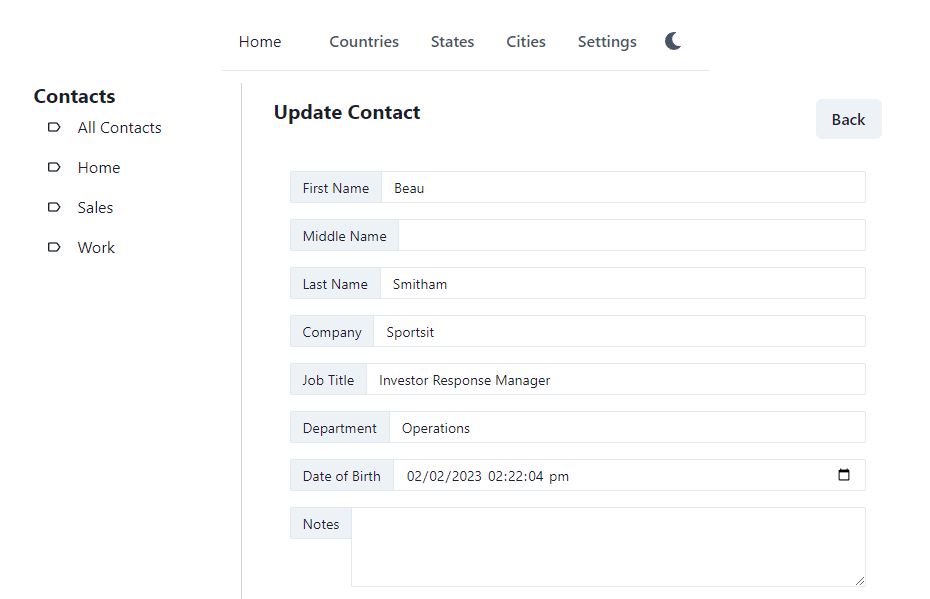
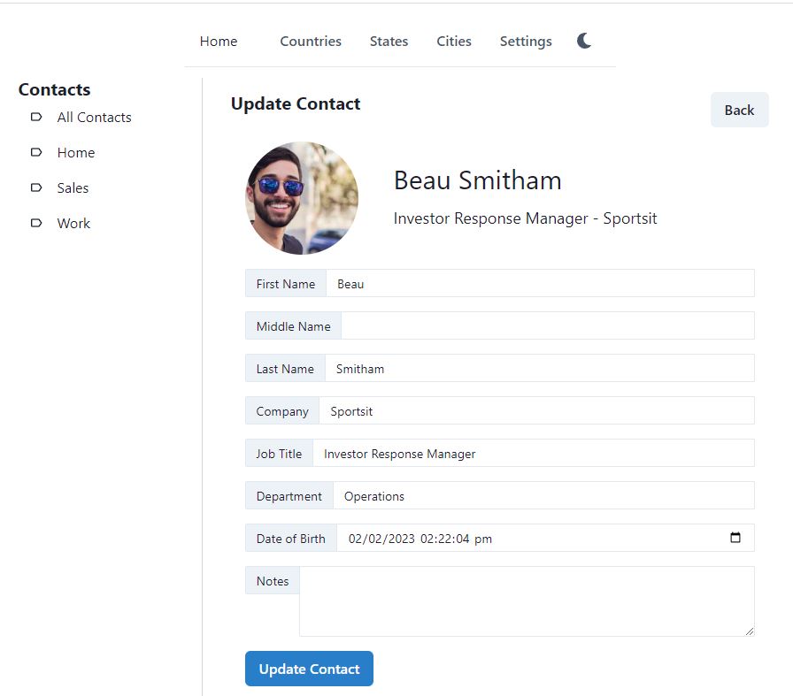
So we will also add profile picture with name and company details. Lets see how it improves our edit contact page.
We will create a new component in React to display the contact header. We will only pass contactId to this component as parameter, the rest will be handled by the component. It will be modular and can be reused in other pages as well.
Create a new file ContactHeader.tsx in src\pages\contact, type rafce and insert the default template code.
This component will accept contactId in props, we will define an interface for accepting the props in functional component parameter. Update your function like below. We have made the contactId prop optional. When no contactId is provided, it will be empty string.
interface ContactHeaderProps {
  contactId?: string;
}

const ContactHeader = ({ contactId = "" }: ContactHeaderProps) => {
  return (
    <Flex></Flex>
  );
};

export default ContactHeader;
Lets work on reading the contactId and displaying the contact header now. We will create a state variable contact, which will be initialized in the useEffect hook like below.
const [contact, setContact] = useState<ContactRes>();

useEffect(() => {
  loadContact();
}, [contactId]);

const loadContact = () => {
  ContactApi.get(contactId).then((res) => {
    setContact(res);
  });
};
We got the contact details, now we need to display it in the component. We will use the Flex layout, which will contain below items
- Profile picture on top
- Contact name and company details
return (
  <Flex>
    <Center>
      <Avatar size={"2xl"} src={contact?.pictureUrl} />
    </Center>
    <Center>
      <VStack ml={10} alignItems={"start"}>
        <Text fontSize={"3xl"}>
          {(contact?.firstName || "") + " " + (contact?.lastName || "")}
        </Text>
        <Text fontSize={"lg"}>
          {contact?.jobTitle} - {contact?.company}
        </Text>
      </VStack>
    </Center>
  </Flex>
);
Now go back to the ContactEdit.tsx and add the new React component before the first name like below. Note that we display the profile picture only when the contactId has some value, which means the profile picture will be displayed when contact is in edit mode.
const showUpdateForm = () => (
    <Box p={0}>
      <Formik
        // initialize formik
      >
        {({ handleSubmit, errors, touched, setFieldValue }) => (
          <form onSubmit={handleSubmit}>
            <Stack spacing={4} as={Container} maxW={"3xl"}>
              <FormControl isInvalid={!!errors.pictureUrl && touched.pictureUrl}>
                {contactId && <ContactHeader contactId={contactId} />}
                <Field as={Input} id="pictureUrl" name="pictureUrl" type="hidden" />
                <FormErrorMessage>{errors.pictureUrl}</FormErrorMessage>
              </FormControl>
              // other form controls like first name, last name etc.
              <Stack direction={"row"} spacing={6}>
                <Button type="submit" colorScheme={"blue"}>
                  {updateText}
                </Button>
              </Stack>
            </Stack>
          </form>
        )}
      </Formik>
    </Box>
  );
Save the files and run the project with npm start. Edit a contact and you will now see the profile picture with some contact details.
Update Profile Picture of Contact
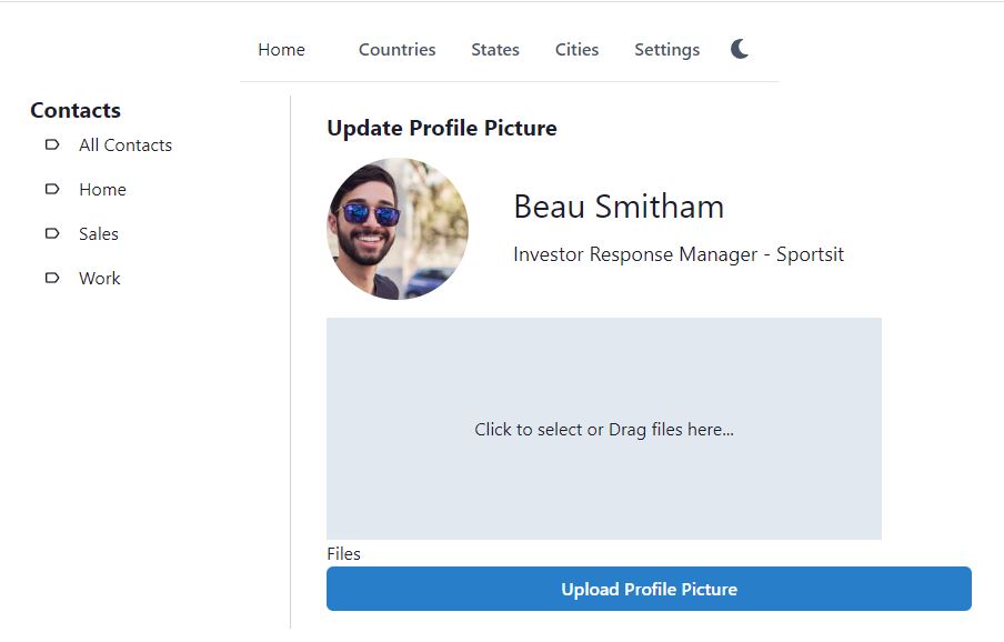
You must be wondering from where did the profile picture came in the above screenshot. We have not developed a way to upload images. We will use react-dropzone component to select/drag drop image file.
Create a new file ContactEditImage.tsx in src\pages\contact folder and type rafce to insert the template code. The url format of upload image page will be http://localhost:3000/contacts/profilePicture/10, where 10 is the contact id.
Lets get started with writing the code for uploading image. We will start by getting the contactId from the url params. We will initialize FormData and react-dropzone. with the code below.
const contactId = params.contactId;

let fd = new FormData();

const { acceptedFiles, getRootProps, getInputProps } = useDropzone();

const files = acceptedFiles.map((file) => (
  <li key={file.name}>
    {file.name} - {file.size} bytes
  </li>
));

acceptedFiles.map((file) => {
  fd.append("File[]", file);
});
Now we will create the form for image upload. The form will include a div, having class name of “dropzone” and input form control having input props from the react-dropzone component. This input inside the div, will render the drop zone area, where users can either drag and drop the files or click anywhere on the area to manually browse and select files for upload.
Once the files are uploaded, they are added to the files collection. We render the files with the dropzone area. Then we will add a submit button, so that the form with image file will be submitted.
const showUploadForm = () => (
  <form method="post" onSubmit={handleSubmit} encType="multipart/form-data">
    <FormControl>
      <div {...getRootProps({ className: "dropzone" })}>
        <input {...getInputProps()} />
        <Center width={500} height={200} backgroundColor={"gray.200"}>
          Click to select or Drag files here...
        </Center>
      </div>
      <aside>
        <h4>Files</h4>
        <ul>{files}</ul>
      </aside>
    </FormControl>
    <Stack spacing={6}>
      <Button type="submit" colorScheme={"blue"}>Upload Profile Picture</Button>
    </Stack>
  </form>
);
The form’s onSubmit is set to call handleSubmit method. The handleSubmit method sends calls the API helper method, which sends the contact Id and form post data to the web API.
const handleSubmit = (event: any) => {
  event.preventDefault();
  ContactApi.updateImage(contactId, fd)
    .then((res) => {
      successToast();
      navigate(-1);
    })
    .catch((err) => {
      console.log(err);
    });
};
The main return method will have the following code. It displays the heading, shows the contact header and the upload form (with drop zone area).
return (
  <Box p={4}>
    <Stack spacing={4} as={Container} maxW={"3xl"}>
      {displayHeading()}
      <ContactHeader contactId={contactId} />
      {showUploadForm()}
    </Stack>
  </Box>
);
Route for the upload image page
<Route path="/" element={<Layout />}>
  <Route index element={<Home />} />
  {/* Contacts */}
  <Route path="contacts" element={<ContactsLayout />}>
    <Route index element={<Contacts />} />
    <Route path="edit" element={<ContactEdit />} />
    <Route path="edit/:contactId" element={<ContactEdit />} />
    <Route path="profilePicture/:contactId" element={<ContactEditImage />} />
How to open the upload image page?
We also need a button or link to upload the image. We can create a new button or link anywhere in the contact edit page. But we will add the link in the contact header component. User will just click on the profile picture, to view existing and upload new image. Open ContactHeader.tsx file and make the Avatar a link. We have just wrapped the Avatar with the link, so that it is clickable now and will open the profile picture page.
<Link as={RouteLink} to={"/contacts/profilePicture/" + contactId}>
  <Avatar size={"2xl"} src={contact?.pictureUrl} />
</Link>
Now edit a contact and click on the profile picture. It will show the existing profile picture and contact details. It will also display the react drop zone area for updating new image. When we select a new image and upload the profile picture, the web API will be called, which is using Cloudinary storage. The profile picture will be uploaded to the Cloudinary and Contact table’s pictureUrl field will also be updated.
Show Labels, Phones, Emails, Addresses, Chats and Websites in Edit Contact Page
The Contact edit page is more complex than the rest of the pages, because it has related data. A contact may have optional phone numbers, emails, addresses and other information. We will show this information directly in the Contact Edit page.
Open ContactEdit.tsx in src\pages\contact folder and add the following code in the main return method. Previously we just had 3 function calls in the Stack, which are displayHeading, error and showUpdateForm. Now we will add 6 more methods to display the list of phone numbers, emails etc.
return (
  <Box fontSize={"md"} width={"2xl"} p={4}>
    <Stack spacing={4} as={Container} maxW={"3xl"}>
      {displayHeading()}
      {error && <AlertBox description={error} />}
      {showUpdateForm()}
      {contactId && showContactPhones()}
      {contactId && showContactLabels()}
      {contactId && showContactEmails()}
      {contactId && showContactWebsites()}
      {contactId && showContactChats()}
      {contactId && showContactAddresses()}
    </Stack>
  </Box>
);
Lets now work on the showContactPhones method. On the left side, we will display heading and an icon for Add. On the right side, we will display the list of phone numbers in table. Adding the heading is easy, we just use Heading component of Chakra UI. Adding plus icon is also easy, we have created AddIcon component, just like we created components for Edit and Delete icons. The Add icon goes to /contacts/{contactId}/phones/edit page, which is the Url for creating a new phone number for the contact Id.
const showContactPhones = () => (
  <Flex>
    <Box>
      <HStack>
      <Heading fontSize={fontSize} >Phones</Heading>
      <Link as={RouteLink} to={"/contacts/" + contactId + "/phones/edit"}>
        <AddIcon size="xs" fontSize="15" />
      </Link>
      </HStack>

    </Box>
    <Spacer />
    <Box>
    <TableContainer>
    <Table variant="simple" size={fontSize}>
      <Tbody>
        {contactPhonesPaged?.pagedList?.map((item) => (
          <Tr key={item.contactPhoneId}>
            <Td>{item.country?.phoneCode}</Td>
            <Td>{item.phone}</Td>
            <Td>{item.phoneLabel?.label}</Td>
            <Td>
              <Link
                mr={2}
                as={RouteLink}
                to={"/contacts/" + contactId + "/phones/edit/" + item.contactPhoneId}
              >
                <UpdateIcon size="xs" fontSize="15" />
              </Link>
              <Link as={RouteLink} to={"/contacts/" + contactId + "/phones/delete/" + item.contactPhoneId}>
                <DeleteIcon size="xs" fontSize="15" />
              </Link>
            </Td>
          </Tr>
        ))}
      </Tbody>
    </Table>
  </TableContainer>
    </Box>
  </Flex>
)
The table displays the phone numbers from the contactPhonesPaged state variable. So we will declare the state variables for phones, emails, addresses etc. as shown below.
const [contactPhonesPaged, setContactPhonesPaged] = useState<PagedRes<ContactPhoneRes>>();
const [contactLabelsPaged, setContactLabelsPaged] = useState<PagedRes<ContactLabelRes>>();
const [contactEmailsPaged, setContactEmailsPaged] = useState<PagedRes<ContactEmailRes>>();
const [contactWebsitesPaged, setContactWebsitesPaged] = useState<PagedRes<ContactWebsiteRes>>();
const [contactChatsPaged, setContactChatsPaged] = useState<PagedRes<ContactChatRes>>();
const [contactAddressesPaged, setContactAddressesPaged] = useState<PagedRes<ContactAddressRes>>();
We also need to load data in these variables. We are already loading contact data in the useEffect hook. We will use the same hook to load phones, emails etc. loadContact method was already there, we will add 6 more methods to load the related data.
useEffect(() => {
  loadContact();
  loadContactPhones();
  loadContactLabels();
  loadContactEmails();
  loadContactWebsites();
  loadContactChats();
  loadContactAddresses();
}, [contactId]);
Lets now define these methods. The API helper methods for these related data were already defined in previous article, we will just call these methods to load data in the state variables. As you can see from the code below that we have called search methods for each API helper method, each search method is passed search dto, which is initialized with the contactId. The response from the API is set in the respective state variable. When the state variable has the data from the API, the respective tables will render again to show the data.
const loadContactPhones = () => {
  ContactPhoneApi.search(new ContactPhoneReqSearch({}, {contactId: contactId})).then(res => {
    setContactPhonesPaged(res)
  })
}

const loadContactLabels = () => {
  ContactLabelApi.search(new ContactLabelReqSearch({}, {contactId: contactId})).then(res => {
    setContactLabelsPaged(res)
    // console.log(res)
  })
}

const loadContactEmails = () => {
  ContactEmailApi.search(new ContactEmailReqSearch({}, {contactId: contactId})).then(res => {
    setContactEmailsPaged(res);
  })
}

const loadContactWebsites = () => {
  ContactWebsiteApi.search(new ContactWebsiteReqSearch({}, {contactId: contactId})).then(res => {
    setContactWebsitesPaged(res)
  })
}

const loadContactChats = () => {
  ContactChatApi.search(new ContactChatReqSearch({}, {contactId: contactId})).then(res => {
    setContactChatsPaged(res);
  })
}

const loadContactAddresses = () => {
  ContactAddressApi.search(new ContactAddressReqSearch({}, {contactId: contactId})).then(res => {
    setContactAddressesPaged(res)
  })
}
In this article we have defined method showContactPhones, which displays the phone numbers in table. You may work on the other methods in the same pattern and display the emails, addresses, labels, chats and websites.
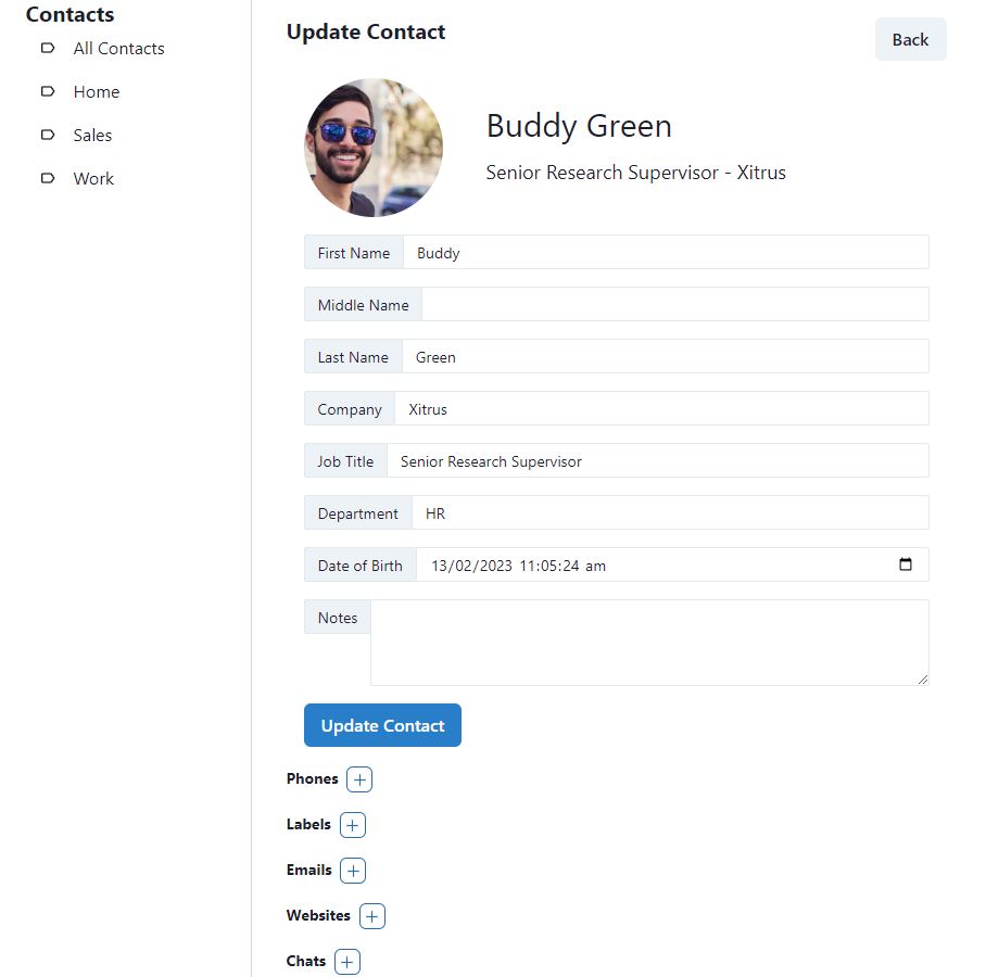
Take some time in building this page, it might seem complex and it includes information from the related tables. It will take more time to develop this page. You may also refer to the GitHub repository for the complete code if you are stuck somewhere or having errors.
Edit pages for Related Data e.g. Phones, Emails, Labels etc.
So far we have written code in Contact Edit page. It can create or edit Contact table only. It displays information from the related tables e.g. phones, labels etc. But how to add a new phone number?
Lets first look again at the Google Contacts edit page. Google Contacts app is very matured in 2023. You can edit Contact details and all the related information on the same page. You click on Add button on the right side of a phone number, it adds a new set of country code, phone and label dynamically, for editing. You can create multiple phone numbers this way, on the same page.
If we follow the same pattern, our app will become more complex, we will have to add and remove the form controls dynamically on client side. It is easy for the end user, but little hard to develop. So in our app, we just displayed the phone numbers, but for editing, we will create separate pages. May be in the next version we will update the UI and handle all the related data updates in the same edit contact page. We will keep this improvement for future.
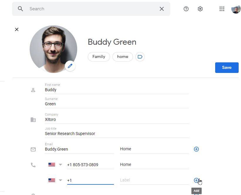
Lets create the edit contact phone page. Create a new file ContactPhoneEdit.tsx in src\pages\contact folder and type rafce to insert the template code.
The url format for creating and editing a phone number is as follows
- http://localhost:3000/contacts/20/phones/edit – create a new phone number for contact id 20
- http://localhost:3000/contacts/20/phones/edit/11 – update an existing phone number (id 11) of an existing contact (id 20)
We will get two Ids from the url params, contactId and contactPhoneId. We will also declare a state variable contactPhone, to store the Contact Phone dto. The phone number has an optional country code and phone label, so we will also create a state variable for selected country and phone label.
const params = useParams();
const contactPhoneId = params.contactPhoneId;
const contactId = params.contactId;
const updateText = contactPhoneId ? "Update Phone" : "Add Phone";

const [contactPhone, setContactPhone] = useState<ContactPhoneReqEdit>(new ContactPhoneReqEdit(contactId));
const [selectedCountry, setSelectedCountry] = useState<CountryRes>();
const [selectedPhoneLabel, setSelectedPhoneLabel] = useState<PhoneLabelRes>();
If we have contactPhoneId in the url params, we will load the contact phone in useEffect hook. The useEffect hook calls loadContactPhone method. In loadContactPhone method, we will call the API helper method to get the phone number. The phone number response dto, returned from the web API will contain the country and phoneLabel data, so we will set the selected country and selected phone label here as well. This is for pre-selecting the country and label in the dropdown.
useEffect(() => {
  loadContactPhone();
}, [contactPhoneId]);

const loadContactPhone = () => {
  setError("");
  if (contactPhoneId) {
    ContactPhoneApi.get(contactPhoneId)
      .then((res) => {
        setContactPhone(res);
        setSelectedCountry(res.country)
        setSelectedPhoneLabel(res.phoneLabel)
        console.log(res)
      })
      .catch((error) => {
        setError(error.response.data.error);
      });
  }
};
Now we will add the formik validation schema using Yup. In the schema, only the phone number is required. Country Id and phone label id are optional. ContactId is a required field, which is already passed in the Url.
const validationSchema = Yup.object({
  phone: Yup.string().required("Phone is required"),
  countryId: Yup.number().nullable(),
  contactId: Yup.number().required().min(1),
  phoneLabelId: Yup.number().nullable(),
});
After defining the schema, we will create the submit method. If contactPhoneId is present in the url params, we will update the phone, otherwise we will add a new phone number for the contact.
const submitForm = (values: ContactPhoneReqEdit) => {
  values = convertEmptyStringToNull(values);
  if (contactPhoneId) {
    updateContactPhone(values);
  } else {
    createContactPhone(values);
  }
};

const updateContactPhone = (values: ContactPhoneReqEdit) => {
  setError("");
  ContactPhoneApi.update(contactPhoneId, values)
    .then((res) => {
      navigate(-1);
    })
    .catch((error) => {
      setError(error.response.data.error);
    });
};

const createContactPhone = (values: ContactPhoneReqEdit) => {
  setError("");
  ContactPhoneApi.create(values)
    .then((res) => {
      navigate(-1);
    })
    .catch((error) => {
      setError(error.response.data.error);
    });
};
Now we come to the main return method, which will call 4 methods to render the edit page.
- displayHeading will display the heading and back button
- error will display the error message from the web API, if any
- ContactHeader will display the profile picture and contact details. It is useful because we are creating a new page for editing the phone number, so the user must know which contact he is editing.
- showUpdateForm will display the Formik form
return (
  <Box width={"lg"} p={4}>
    <Stack spacing={4} as={Container} maxW={"3xl"}>
      {displayHeading()}
      {error && <AlertBox description={error} />}
      <ContactHeader contactId={contactId} />
      {showUpdateForm()}
    </Stack>
  </Box>
);
Next we create the form for creating or editing the phone number. The form consists of 3 form controls
- First form control is for displaying the country dropdown. We have reused the CountryDropdown component. The same component was used in the Search state page. We have reused it here, it can pre-load and select the country in edit mode.
- Second control is for the phone number
- Third form control is for the phone label. It displays the PhoneLabelDropdown component. In edit mode, the phone label will pre-load and select the label.
const showUpdateForm = () => (
  <Box p={0}>
    <Formik
      initialValues={convertNullToEmptyString(contactPhone)}
      onSubmit={(values) => {
        submitForm(values);
      }}
      validationSchema={validationSchema}
      enableReinitialize={true}
    >
      {({ handleSubmit, errors, touched, setFieldValue }) => (
        <form onSubmit={handleSubmit}>
          <Stack spacing={4} as={Container} maxW={"3xl"}>
            <FormControl isInvalid={!!errors.countryId && touched.countryId}>
              <FormLabel htmlFor="countryId">Country Id</FormLabel>
              <Field as={Input} id="contactId" name="contactId" type="hidden" />
              <Field as={Input} id="countryId" name="countryId" type="hidden" />
              <CountryDropdown
                selectedCountry={selectedCountry}
                handleChange={(newValue?: CountryRes) => {
                  setSelectedCountry(newValue);
                  setFieldValue("countryId", newValue?.countryId || "");
                }}
              />
              <FormErrorMessage>{errors.countryId}</FormErrorMessage>
            </FormControl>
            <FormControl isInvalid={!!errors.phone && touched.phone}>
              <FormLabel htmlFor="phone">Phone</FormLabel>
              <Field as={Input} id="phone" name="phone" type="text" />
              <FormErrorMessage>{errors.phone}</FormErrorMessage>
            </FormControl>
            <FormControl isInvalid={!!errors.phoneLabelId && touched.phoneLabelId}>
              <FormLabel htmlFor="phoneLabelId">Phone Label</FormLabel>
              <Field as={Input} id="phoneLabelId" name="phoneLabelId" type="hidden"
              />
              <PhoneLabelDropdown
                selectedPhoneLabel={selectedPhoneLabel}
                handleChange={(newValue?: PhoneLabelRes) => {
                  setSelectedPhoneLabel(newValue);
                  setFieldValue("phoneLabelId", newValue?.phoneLabelId || "");
                }}
              />
              <FormErrorMessage>{errors.phoneLabelId}</FormErrorMessage>
            </FormControl>
            <Stack direction={"row"} spacing={6}>
              <Button type="submit" colorScheme={"blue"}>
                {updateText}
              </Button>
            </Stack>
          </Stack>
        </form>
      )}
    </Formik>
  </Box>
);
Now when we edit the existing phone number, we will get the following interface.
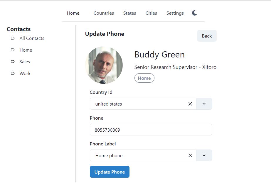
You can create the remaining 5 edit pages in the same pattern, we will not go into the details of each page, as it would take too much space here in one article. The complete code of the project is available at GitHub for your reference.
After completing the edit and delete pages for contact phone, email, address, chat, label and website, and entering some data, the edit contact page will finally look like below.
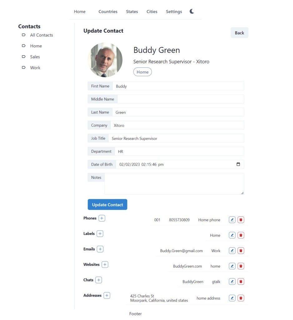
Delete Contact Page
The delete contact page will just show the contact profile picture and some details, it will open confirmation dialog box. The contact will be delete only when the user clicks on Confirm Delete button. Below is the screenshot of the Delete contact page.
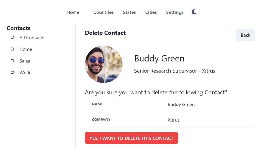
We have written many delete pages in the previous articles. Delete Contact page is not special, so we will not write the code code here. You may continue to write yourself or view from the GitHub repository.