Previously we created dropdowns for Country and State. The dropdowns are generic and can be used in listing and edit pages. On the backend these dropdowns call search APIs, take search text as input and search the database in name or label fields.
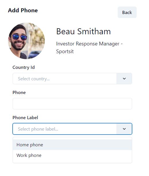
Now we need the dropdowns for all the 6 label definitions. Take a look at the screenshot below to get an idea where the label dropdowns will be used.

In the above screenshot we can choose a label for contact phone number. We ask the user to search and select an appropriate label using the dropdown, it is not free text based, but user can only choose a dropdown from an existing label.
There are 6 types of labels, so we will need to create 6 dropdowns. In this article, we will share the code to create one dropdown, for the phone label. You can create other dropdowns on the same pattern.
Create a new file PhoneLabelDropdown.tsx in src\dropdowns and add the following code.
interface PhoneLabelDropdownParams {
  handleChange?: any;
  selectedPhoneLabel?: PhoneLabelRes;
}

const PhoneLabelDropdown = ({handleChange, selectedPhoneLabel}: PhoneLabelDropdownParams) => {
  const [inputValue, setInputValue] = useState("");
  const [items, setItems] = useState<PhoneLabelRes[]>([]);
  const [isLoading, setIsLoading] = useState(false);

  const loadPhoneLabel = () => {
    setIsLoading(true);
    PhoneLabelApi.search(new PhoneLabelReqSearch({ searchText: inputValue }, {}))
      .then((res) => {
        setItems(res.pagedList);
      })
      .finally(() => setIsLoading(false));
  };

  useEffect(() => {
    const timer = setTimeout(() => {
      loadPhoneLabel();
    }, 1000);

    return () => clearTimeout(timer);
  }, [inputValue]);

  const handleInputChange = (newValue: string) => {
    setInputValue(newValue);
  };

  return (
    <Select
        getOptionLabel={(c) => c.label || ""}
        getOptionValue={(c) => c.phoneLabelId || ""}
        options={items}
        onChange={handleChange}
        onInputChange={handleInputChange}
        isClearable={true}
        placeholder="Select phone label..."
        isLoading={isLoading}
        value={selectedPhoneLabel}
      ></Select>
  );
}

export default PhoneLabelDropdown
The dropdown will accept two props, so we will create an interface for the props. We are taking full advantage of TypeScript, so that each dropdown will accept only strong types instead of any type. There are two props.
- handleChange – this is the method that will be executed when dropdown value changes
- selectedPhoneLabel – this is the value if we want to pre-select the dropdown. This is very useful in case of Edit pages, when we want to preload the label.
Then we have three state variables
- inputValue – the string that user types
- items – array of type PhoneLabelRes, returned from the web API, as a search result
- isLoading – icon to display when the search is in progress and the dropdown is loading values from the web API
The useEffect hook is created, which fires when there is a change in inputValue. It calls loadPhoneLabel method, whenever the user types in something.
loadPhoneLabel is the method that calls the PhoneLabelApi.search method, which we created previously. It calls the web API, passes user typed search string as search params, returns the result from the web API and set the items.
We used Chakra-react-select’s Select component, which is based on Chakra UI Select dropdown. The only reason to use chakra-react-select is that it adopts very well to the dark or light theme from Chakra UI.
You can check the GitHub repository for source code for all the dropdowns.