In this article we will create a new layout for the Settings menu.
The Main Layout
So far we have main layout defined in Layout.tsx. All pages use this layout file. The main layout has the following items.
- Header – which contains top menu
- Outlet – which contains the React component that uses this layout
- Footer – can contain footer menu, copyright and any other items.
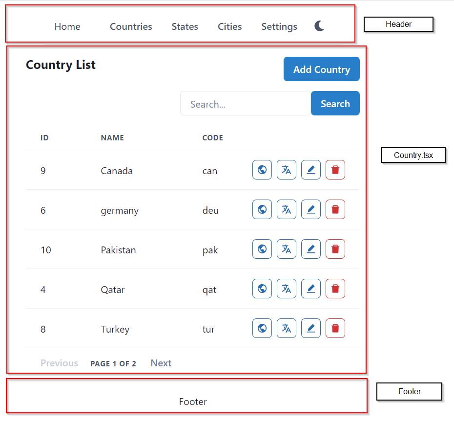
Lets take example of the Country page. Have a look at the screenshot below.

The Country.tsx page uses the main layout, so in the layout, React replaces the contents of Country.tsx with the Outlet.
And when you open States.tsx, which also uses the main layout, React replaces the contents of State.tsx with the Outlet.
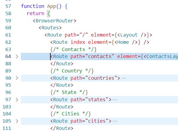
In App.tsx, the main Route uses the element Layout. All other elements like Countries, Cities, States are inside the main Layout. Only this way, they will be replaced with the Outlet.
The Urls work as below
- / – will render the layout
- /countries – will render the main layout, and render countries.tsx in the Outlet
- /cities – will render the main layout, and render the cities.tsx in the Outlet

The Settings Layout
Just like a layout has a regular element as its child, it may also have another layout as its child.
/countries route uses Layout.tsx + Countries.tsx (in Outlet)
/settings route can also use Layout.tsx + Settings.tsx (in Outlet)
Settings.tsx will have its own header, footer, sidebar, any other element and an Outlet.
Lets first create the settings layout. In src\layout folder, create a new file SettingsLayout.tsx and add the following code.
import { Box, Center, Flex } from "@chakra-ui/react";
import { Outlet } from "react-router-dom";
import {CgOrganisation} from 'react-icons/cg';
import LeftSideMenu, { LinkItemProps } from "./LeftSideMenu";

const LinkItems: Array<LinkItemProps> = [
  { name: "Label", icon: CgOrganisation, href: "/settings/labels" },
  { name: "Email Label", icon: CgOrganisation, href: "/settings/email-labels" },
  { name: "Phone Label", icon: CgOrganisation, href: "/settings/phone-labels" },
  { name: "Address Label", icon: CgOrganisation, href: "/settings/address-labels" },
  { name: "Website Label", icon: CgOrganisation, href: "/settings/website-labels" },
  { name: "Chat Label", icon: CgOrganisation, href: "/settings/chat-labels" },
];
const SettingsLayout = () => {
  return (
    <Flex width={"3xl"} mt="2">
      <Box w="250px">
        <LeftSideMenu menuHeading="Settings" menuItems={LinkItems} />
      </Box>
      <Center bg="gray.300" w="1px"></Center>
      <Box width={"100%"} flex="1">
        <Outlet />
      </Box>
    </Flex>
  )
}

export default SettingsLayout
You will get error on LeftSideMenu and LinkItemProps. You can get the LeftSideMenu file from GitHub.
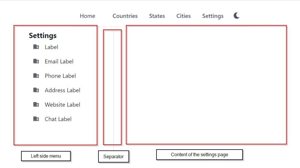
The settings layout consists of 3 sections in horizontal direction. The main layout has 3 sections in vertical direction, because it has top menu, center content and footer at bottom. Whereas in the settings layout, we need left side menu, a separator and content at the right side. See the screenshot below.

The menu items are created in the SettingsLayout.tsx page as array of type LinkItemProps. LinkItemProps has 3 members.
- name – appears as label, display
- icon – icon to display for the LHS menu
- href – the url of the LHS menu
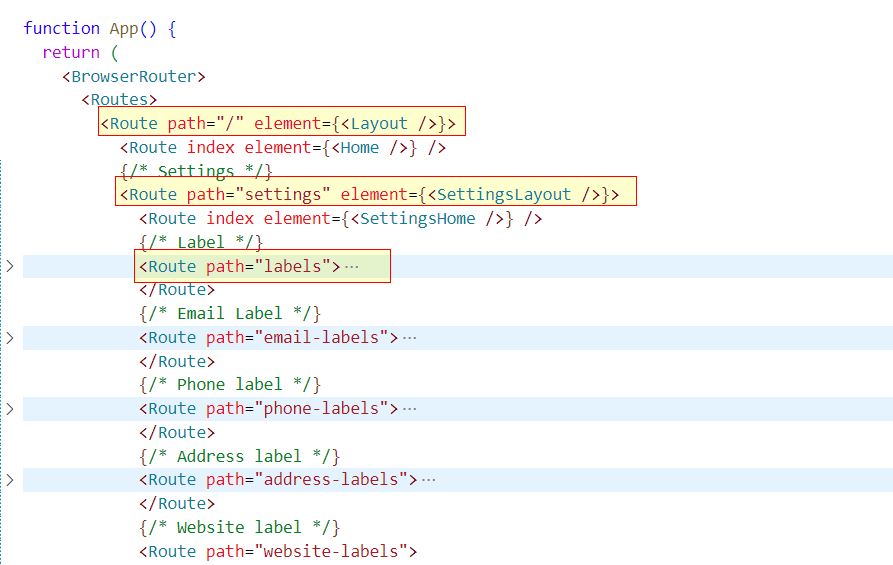
The settings layout will have 6 children for the label types. In App.tsx, the hierarchy of routes will be as below
- / – Layout.tsx
- /settings – Layout.tsx + SettingsLayout.tsx (in Outlet)
- /settings/phone-labels – Layout.tsx + SettingsLayout.tsx (in Outlet) + phoneLabels.tsx (in Outlet)

Complete code can be downloaded from this GitHub repository.